Here is the population pyramid for Spain in 2014
:
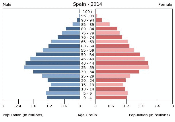
We can see that there aren't very many young people, We can also see other information. Who has a longer life expectancy, men or women?
The pyramid is wider in the middle. This means that the population gre rapidly in the past, but is now decreasing.
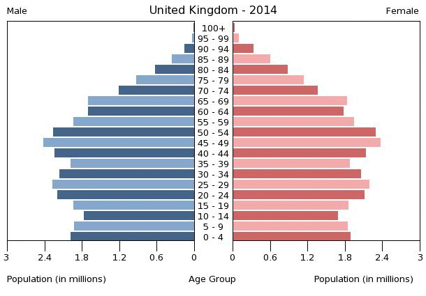
Here is the pyramid for United Kingdom in 2014. How is it different from Spain's?
Germany 2014:

Here is the population pyramid for Madagascar, home of our sister school in the project NAMANA:
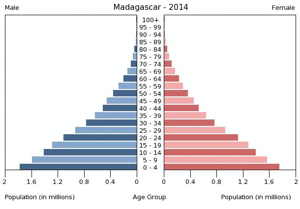
Is this population growing or decreasing? What about the life expectancy of the people?
Population pyramids can tell us a lot!
No hay comentarios:
Publicar un comentario